

Fundraising Experience
Powering competitive advantage
Volunteer Health Clinic (VHC), a non-profit healthcare organization, operates rely largely on donation through fundraising campaigns. We are dedicated to creating a mobile-first digital experience where technology and business processes come together, fostering an environment for sustainable donor relationships.
My Role
Product Designer
Timeline
3 months
Deliverables
Product Strategy
Competitive Research and Analysis
UX Roadmap
Design for Conversion
User Flows
Story mapping
High-Fidelity Mockups
Responsive Design
Keywords
Strategic Product Thinking
Growth Design
0-1
Business Impact
It all starts with one simple question.
Can I donate online?
In this post-pandemic, digital-first fundraising environment, donors have new expectations for interacting with their favorite nonprofits.
As we embrace internet technology to raise awareness and accessibility, we are thrilled to see a revolution of how we communicate with our supporters. Unlike traditional fundraising methods at VHC, which are in-person campaign events or direct mail solicitations that are easy to be ignored and time-consuming to follow, the
mobile-first digital experience provides the donor a platform that they can donate whenever, wherever in their browser in a couple of clicks.
It's an important strategic asset that helps the business to achieve competitive advantage.
The Story
While we're focused on restructuring the VHC website, I'm also actively engaging in strategic planning for our new website to ensure that user-centered insights are integrated with our business strategy. How I did it? It's a long story. I'll share the one of them with you - creating the fundraising experience.
Through a one-day online fundraising campaign experiment, we achieved a 5% conversion rate, total of 237 donors which is 30% growth from last in-person fundraising campaign, plus a total of $13,777 donation amount in 24 hours - that is a 50% increase from last campaign!
Now, let's rewind to the beginning of the story...
The UX Strategy
From big picture to tactics
1. Vision
Initial
Value Proposition
We established our initial value proposition effortlessly and quickly.
We start with the purpose: Deliver a seamless digital fundraising experience for donors.
Making life easier and better. Why not?
Conduct
Competitive Research & Analysis
Competitive Advantage is essential to the business long-term existence. In this case, we use one of the most common ways to achieve the competitive advantage: Differentiation.
This is where our actual power lies and here is how we uncover it.
Competitive Research
To be competitive, we need to know what's out there, what has worked, and what has not worked. To connect the dots, I first collect 6 competitors, including 3 direct competitors and 3 indirect competitors, from the competitive data points which will greatly help evaluate our value proposition.


Competitive Analysis
SWOT (Strengths, Weaknesses, Opportunities, Threats) Analysis from the competitor's perspective moves us into the land of make-believe.
Identify
Gaps and Opportunities
At first, we believed that removing or reducing friction in all essential interactions to create a seamless user experience would sufficiently attract and motivate more donors through our online platform. However, this approach is generic and easily replicable that won't ensure the long-term growth and sustainability of the business.
What we learned from the the competitive analysis is that people are attracted to products they personally value and emotionally connect with. The more individuals feel personally fulfilled and experience growth through their contributions, the more engaged they become. Potentially, the best business model for this concept is setting up a sustained recurring fundraising program which creates an exclusive group that makes supporters feel more connected.
Re-evaluated
Value Proposition
Deliver a compassionate and curated digital fundraising experience for donors.
2. Strategic goals and measures
Finding
User Goals
Our primary user segment is the donors through fundraising campaigns.
Feature request = User Goals/ Needs
/
By simply offering a platform that allows donors to complete the task is not the solution to their request of donating online. From researches (interviews), we found our users actually want:
1. A streamlining process that reduce the stress and uncertainty completing donation.
2. To achieve a greater sense of personal fulfillment and growth through contributions with emotional resonance.
Align & Measure
goals and success
Key Metrics to Track
IMPACT AND GROWTH
-
4% fundraising conversion rate.
-
Donor engagement metrics: total numbers of donor & 25% donor growth rate
-
Fundraising metrics: total donation amount & 30% amount growth rate.
SATISFACTION
-
70% share of positive feedbacks from donors.
Goals
STREAMLINE
Reduce the stress and uncertainty in donation process.
PERSONAL FULFILLMENT
Achieve a greater sense of personal achievement and growth through contributions with emotional resonance.
3. Plan
Planning
UX Roadmap
Now
Fundraising Campaign:
Run donation experiments through campaign landing pages.
Next
Long-term Existence:
Integrate into VHC official website and set up monthly fundraising program.
Future
Self-sustaining Program: Bring in reliable funding year after year and optimize so that the user can seamlessly across channels.
The Experiment
of Design for Conversion
"Amplify Austin Day": A Fundraising Experiment
From raising awareness of VHC's value proposition
to converting people into engaged donors
VHC participated the "Amplify Austin Day" fundraising campaign for non-profit organizations on
March 6&7, 2024. We recognize this is a great opportunity to test and validate our strategy for the fundraising experience design.
Here's our five-step: explore, define, identify, craft and validate.
Explore the User Flow

AWARENESS
The potential user sees the campaign Ad.
INTEREST
They click on the Ad.
DESIRE
They find the fundraising page relevant to their needs.
ACTION
They click on the CTA to start getting immersed.
Define the Experiment
-
Value proposition - Deliver a compassionate and curated digital fundraising experience for donors.
-
Experiment type - Landing page
-
Start/end date - March 6, 2024 through March 7, 2024
-
Experiment details - Running from Ad on Facebook. Analyze the outcome of the campaign and validate the landing page design.
-
Hypothesis - Donors are more inclined to donate online rather than in person.
-
Validation method - Conversion rate; Total donors; Total fund collected; Feedbacks
-
Minimum success criteria - 4% conversion on the landing page.
Identify the Key Features
We've identified user goals as part of our product strategy.
However,
Now we're facing the million dollar question:
How do we map users goals to product features?
Map needs to features:
from high-level to detailed functionality
I started with the high-level user story to define the main activities and epics. Then, I broke down these epics into smaller stories and tasks for key features, mirroring natural face-to-face communication more closely.
What if...
donors want to make a quick decision?
The reality is - it takes time for people to make decisions. Though, the delay in decision-making can sometimes because a lack of relatability to what's being presented in the message.
The most effective way to achieve the resonance is through Stories. Stories that clearly explain how their contributions will be spent enabling people to quickly relate and make decisions.
User Goals
As a donor, I want to achieve a greater sense of personal achievement and growth through contributions with emotional resonance.
Activities
Select a method
Epics
Browse options
I want to learn how donations are used and be aware of the impact that I make.
User Stories/ Tasks
View a donor list
Explore how fund spent
Select to learn more
Donor Wall
Features
Impactful Messaging
As a donor, I want to be stress-free and uncertainty-free in donation process.
Donate
Click on CTA
I want to complete the donation in a couple of clicks.
Fill out the form
Confirm Donation
I want to know if I donate successfully.
Receive confirmation
Enter payment
Share
I want to be acknowledged and feel connected.
Read a message
Share on Social Media
Submit
Donation form
Confirmation Message
Thank you Note
Social Media Links
Testimonial
Clear CTA buttons
Craft the Landing & Confirmation Page


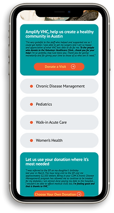

Donor Wall
Similar to a real-life Hall of Benefactors, the donor wall welcomes users to join the story right at the start of their journey. It acknowledges and honors individuals who have made contributions and inspires others to participate.
Ticker: Display dynamic numbers and donor list in a compact and engaging manner and also offer unique interactions.
Allocate resource and focus
Good strategy is about making choices. We decided to use the donation check out forms provided by Amplify Austin, so that we focus on delivering a whole smooth process and being able to deliver things on time.
Impactful Messaging
Stories: Clearly outline how donations are used and their impactful results, fostering emotional connections that allow donors to feel connected to a meaningful cause and enhance their sense of pride and achievement.
Content Organization: Organize and divide the main content into two groups to create a clear visual hierarchy.
Instant gratification: No registrations/logins required to complete tasks.
Testimonials
Showcase real-life examples of how donations have positively affected individuals or communities."It-could-happen-to-me" aspect creates a close connection to the story.
Clear CTA buttons
No long sets of instructions. Use "calls to action" as clear direction on what to do. Keep labels short and quick to read.
Responsive Design


Validate the Solution
Our fundraising process is quick and thorough, but... there is something missing. The donation checkout requires more than just confirmation. Immediate receipt issuance is also essential.


The Results
Our conversion rate is
5%
calculated by platform
Positive feedbacks from
90%
donors
Total of
237
+30%
donors
We raised
$13,777
+50%
in 24 hours

What' Next?
With the UX roadmap we previously planned out in our strategy study, we now are more confident to invest additional time and resources to develop the VHC online fundraising platform.
The fundraising experiment for "Amplify Austin Day" marks a strong beginning for our growth-focused design efforts. Moving forward, we need to actively seek out further growth opportunities such as donor acquisition, conversion and retention to expand our impact.
Takeaways
UX to lead and influence at a higher level
It's not about "having the final call"; it's about consistently solving problems, visualizing solutions, and becoming an essential part of the team.
When considering a change
It's crucial to acknowledge the moment and move forward without hesitation. Responding decisively ensures that challenges or opportunities are addressed promptly and effectively. By maintaining clarity of purpose and remaining open to change, we can navigate the situation with confidence and resilience.